The mouse cursor is the one interface element visitors touch on every single interaction. Change it, and you change how your whole site feels. These principles help you design custom cursors that guide attention instead of fighting it.
Principle 1: The hotspot is sacred
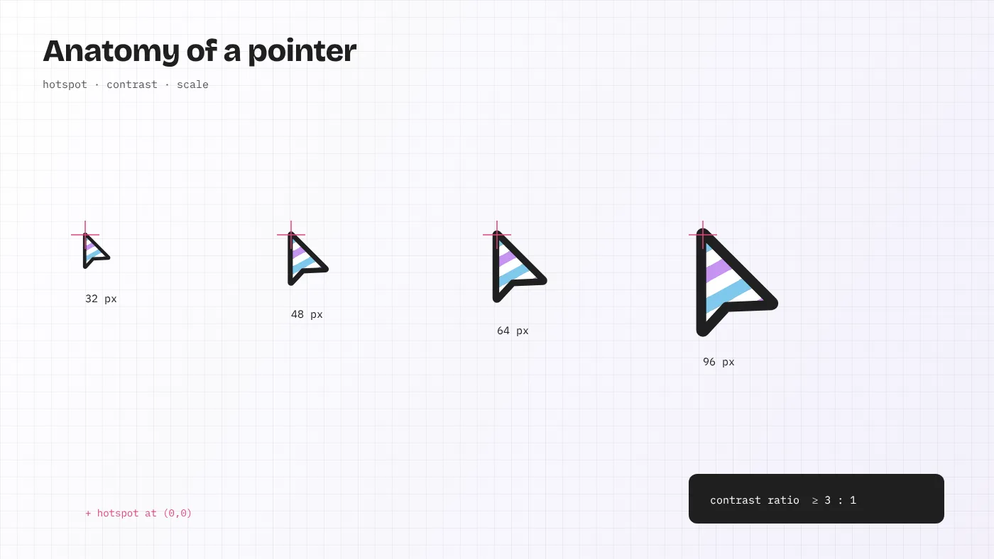
Every cursor has a hotspot: the single pixel that registers clicks. For the standard arrow it is the tip. For a crosshair it is the centre. When a custom cursor’s visual point and its real hotspot disagree, people miss buttons by a few pixels and blame the site.
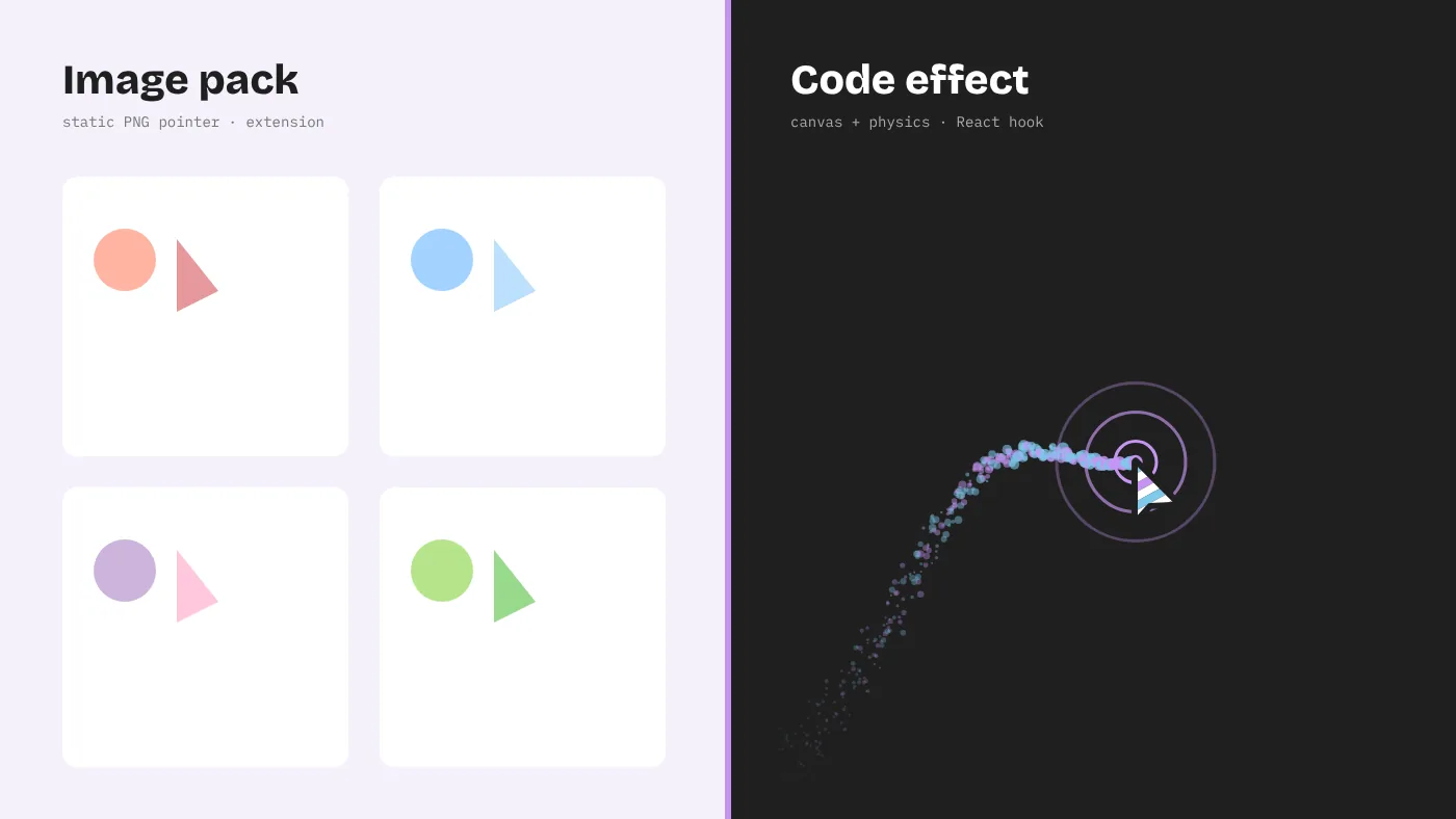
For static CSS cursors, set the hotspot explicitly: cursor: url(arrow.png) 2 2, auto;. The two numbers are the X and Y offsets from the image’s top-left corner. For interactive effects that draw their own pointer on a canvas or element, translate the drawing so the visual tip lands exactly on the pointer coordinates. Then test with tiny targets — a 16-pixel checkbox is a good benchmark. If you can hit it reliably at speed, the hotspot is right.
Effects in the Cursor Custom gallery fall into two groups. Some leave the native pointer visible and draw around it, which keeps the hotspot honest automatically. Others replace it with a custom shape, such as Crosshair Scope, where the centre dot marks the hotspot. When you adapt the second kind, keep that visual anchor obvious.
Principle 2: Contrast beats colour
A pointer must be visible on every background it crosses: white articles, dark footers, photos, video. Brand colour alone rarely manages that. The tested approach is a two-tone pointer — a fill and an outline of contrasting lightness — which is why both Windows and macOS default to a dark arrow with a light edge or the reverse.
- Aim for at least 3:1 contrast between the pointer and adjacent colours, matching the WCAG requirement for non-text interface components.
- If your brand palette is pastel — like our own sky blue
#7FC8ECand lilac#C694F2— pair it with a near-black outline such as#202020. The Cursor Custom logo is exactly this pattern: soft stripes inside a heavy dark frame. - Consider
mix-blend-mode: difference, used by the Difference Blend effect. It inverts whatever lies beneath, so it stays visible on any background, though it can look harsh on photographs.
Principle 3: Size for the screen, not the mockup
Designers often draw cursors at 64 pixels in a design tool, zoomed in, and then ship them too large. System pointers are about 32 CSS pixels at standard settings, and people are used to that scale.
| Element | Comfortable range | Notes |
|---|---|---|
| Static custom pointer | 24–32 CSS px | Browsers limit CSS cursor images; 32 px is the safe maximum |
| Follower ring | 28–48 px diameter | Large enough to frame a link, small enough not to hide text |
| Spotlight radius | 120–220 px | Smaller feels claustrophobic, larger loses the effect |
| Particle size | 2–8 px | Bigger particles read as objects, not as a trail |
Remember high-density displays. A canvas effect should scale its backing store by the device pixel ratio so a 2 px particle stays crisp on Retina and 4K screens.
Principle 4: Motion should explain, not decorate
Good cursor motion communicates something: speed, intent, state. Elastic Ring squashes as you accelerate, telling you how fast you moved. Magnetic pulls a button toward the pointer, telling you it is the target. Ripple Wave confirms a click. Those effects explain.
Decorative motion — glitter that follows every movement regardless of context — gets tiring quickly. Ask what each effect is telling the visitor. If the answer is “nothing, it just looks nice,” limit it to one moment: a hero section, a landing page, a single interactive panel.
Timing guidelines
- Follow lag: a smoothing factor between 0.12 and 0.25 per frame feels responsive. Below 0.08 the ring trails so far behind that it feels broken.
- Trail lifetime: 400–900 ms. Longer trails become clutter.
- Click feedback: 150–300 ms for a ripple or squash. Anything longer delays the visitor’s sense that the click worked.
Principle 5: Never hide meaning
System cursors carry information. The hand means “this is a link.” The I-beam means “you can select or type here.” The not-allowed symbol means “disabled.” A custom cursor that replaces everything with one shape erases those signals.
- Restore native cursors over form fields; people need the I-beam to place a caret.
- Change your custom pointer’s state over links and buttons — grow the ring, fill it, or show the hand.
- Keep
cursor: not-allowedor a clear equivalent on disabled controls. - Keep keyboard focus outlines. A cursor effect is no substitute for visible focus states.
Principle 6: Respect people who opt out of motion
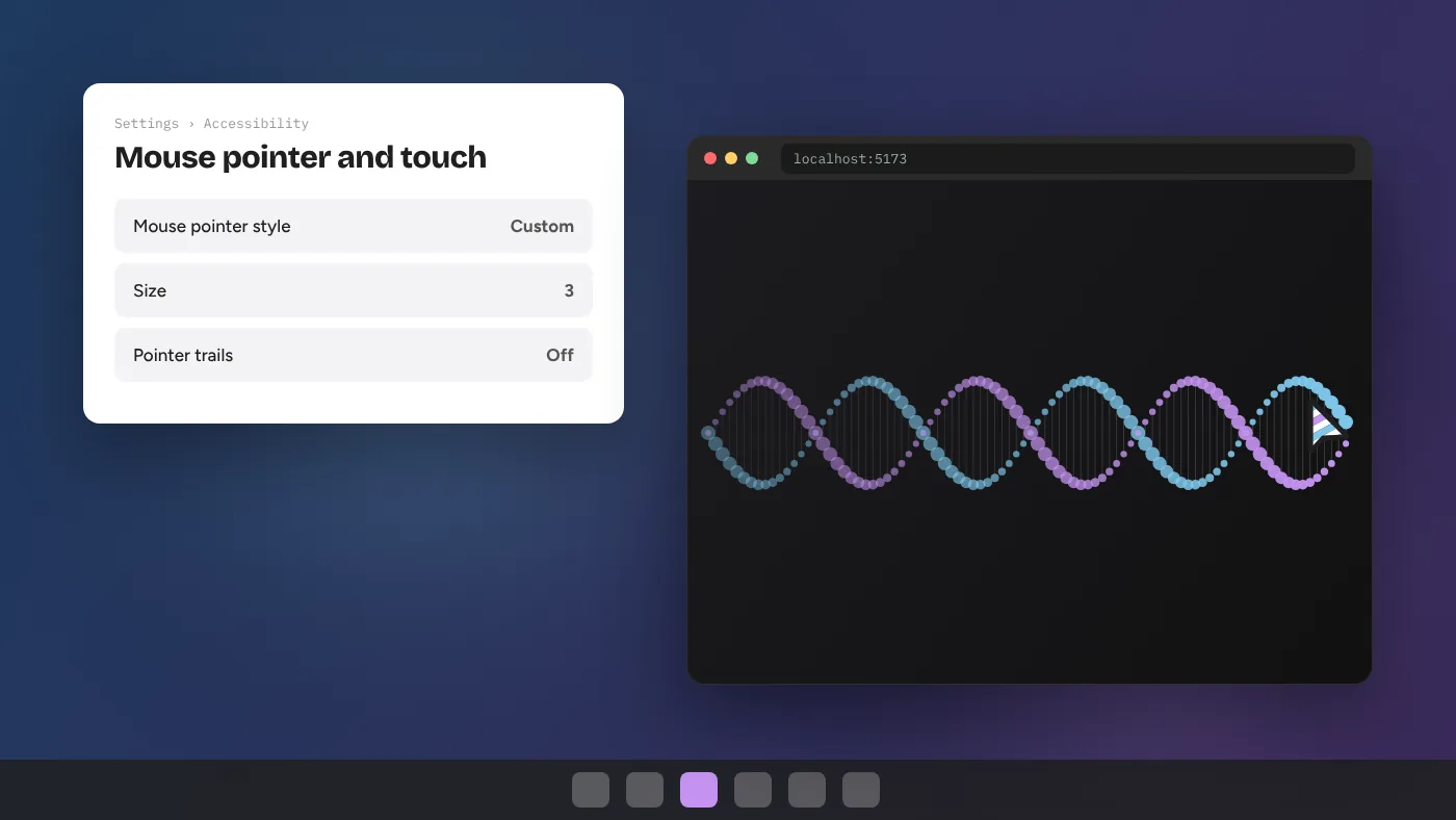
Operating systems let people request reduced motion because animation can trigger nausea, migraines or vestibular symptoms. Browsers expose that choice through prefers-reduced-motion. Respecting it is not optional for a responsible site.
const calm = window.matchMedia('(prefers-reduced-motion: reduce)').matches;
const fine = window.matchMedia('(pointer: fine)').matches;
if (!calm && fine) startCursorEffect();
When reduced motion is on, either skip the effect or replace it with a static alternative — a ring that appears on hover without following lag, for example. The pointer check matters too: on touch screens there is no hovering pointer, so following effects only appear on tap, and some, like Spotlight, would hide content.
Principle 7: Consistency across the site
A cursor that changes style from page to page feels like a bug. Pick one primary behaviour for the site, define its states (default, hover, active, disabled), and stick to it. Special effects can appear in dedicated places, such as a playful hero, but the everyday pointer should stay stable.
This is easier with a shared preset file that stores your cursor colours, sizes and physics values. The cursor library guide describes how to set one up.
Principle 8: Test like a visitor
Run through this checklist before shipping any custom mouse cursor:
- Click the smallest target on the page ten times quickly. Any misses?
- Move across your lightest and darkest sections. Is the pointer always visible?
- Select text in a paragraph and type in a form field. Do the native cues appear?
- Turn on reduced motion in your OS. Does the effect calm down?
- Open the page on a phone. Is everything usable with no hover?
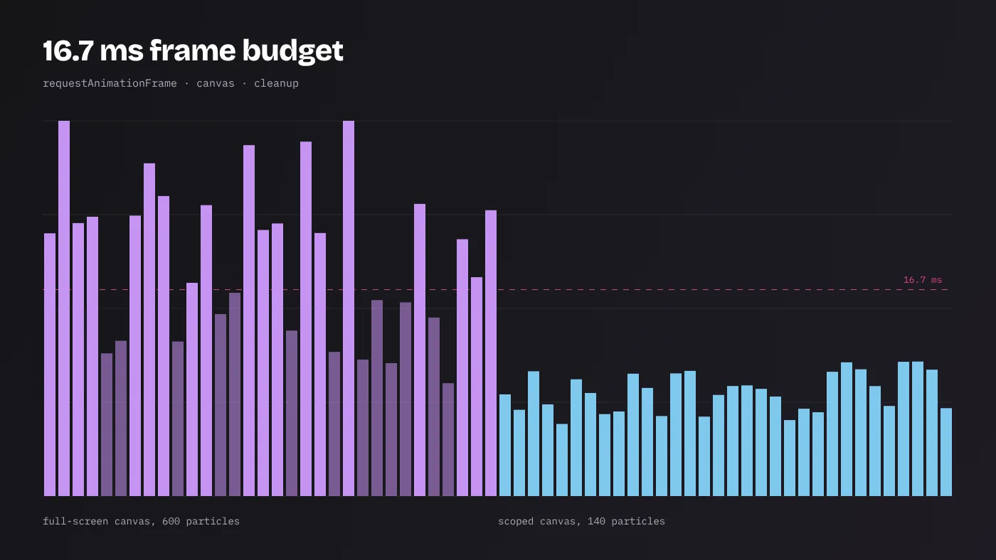
- Throttle CPU 4× in DevTools. Does the pointer still keep up?
- Use the site for five minutes. Is the effect still pleasant, or has it become noise?
The last test is the most honest. Cursor effects are judged in the first second but lived with for the whole visit.
Designing cursor states
A complete custom cursor is a small state machine, not a single picture. Define at least these states before writing code:
| State | When it applies | Typical treatment |
|---|---|---|
| Default | Over plain content | Base size and colour |
| Hover | Over links and buttons | Grow 1.3–1.6×, fill or change colour |
| Active | While the button is pressed | Shrink slightly for tactile feedback |
| Text | Over inputs and selectable text | Hide the effect, show the native I-beam |
| Disabled | Over disabled controls | Fade or show the not-allowed signal |
| Hidden | Outside the effect’s area or on touch | Native pointer only |
Writing this table down first keeps designers and developers aligned, and prevents the most common bug: a beautiful default state with no thought given to forms.
Brand expression without losing usability
A cursor can carry a brand as strongly as a logo, but it should do so through qualities rather than literal pictures. Colour is the obvious lever. Motion character is the subtler one: a calm, slow-settling ring suits a luxury or wellness brand, while a quick, springy ring suits a playful product. Shape is the third lever — a rounded follower feels friendly, a sharp crosshair feels technical.
Pick one lever to push and keep the other two conventional. A brand-coloured, conventionally shaped, calmly moving pointer will feel distinctive and stay usable. Push all three at once and the cursor starts to compete with the content it is supposed to serve.
Prototyping before polishing
Cursor ideas are hard to judge in static design tools because their quality lives in motion. Prototype early in code. The Cursor Custom gallery is useful here: pick the effect closest to your idea, tune its parameters until the movement feels right, and record the values. Then place it over a screenshot of your real page to check contrast and scale. Only after the behaviour feels right is it worth refining shapes and colours. Teams that start with motion and finish with visuals usually end up with cursors that feel natural; teams that start with a polished static drawing often discover too late that it feels heavy once it moves.
Applying these principles to the gallery
The Cursor Custom gallery is a convenient lab for this work. Each effect has a tuning panel, so you can test size, timing and colour against these guidelines in real time. Try Elastic Ring with stiffness at the low end and watch it lag; raise it until it feels attached. Open Spotlight and adjust the radius until the page feels explorable rather than hidden. Load Difference Blend over your own screenshots to judge contrast.
Design is the part no library can do for you. But with the hotspot exact, contrast strong, size restrained, motion meaningful and every opt-out respected, a custom cursor becomes what it should be: a quiet signature that makes the whole site feel considered.